Monday, December 19, 2011

The Colors of Salty and Sweet


Start with the chocolate of your choice, add a drizzle of vegetable oil and microwave for about 2 minutes then mix until smooth.


Line cookie sheet with wax paper. I used foil because I didn't have any wax paper but be careful foil doesn't stick to the chocolate.


Dip and drizzle on anything that's not moving.


Refrigerate for about 15 minutes.


And enjoy!


Not only is salty and sweet one of thee most amazing 
flavors combined but they also make a beautiful color duo. 

If you like this Color Recipes, 
contact me and we can have this amazing snack in your home!

Donna Frasca, A color specialist in Charlotte.


Tuesday, December 13, 2011

Talking About Texture


Interior Design is so much more than just color - it's also about texture.

Feel texture in the kitchen with this braided place mat. Don't want to use it as a place mat? You can also buy several and use them as wall hangings. Anything can be art, you just have to use your imagination.


Keep your piggies happy with a lot of texture from this Sheepskin rug. Wool not only looks amazing but it's also soil repellent and durable which is why it's a great choice for a rug. Invest in wool when you can.

This acrylic, wool and poly blend is super soft - in any color.

And last but not least, a little visual texture for the eyes. 
It looks like an alien but would be a perfect fit for a teens room.

Home decor from IKEA


Color Expert catering 
to the homes in South Charlotte


Monday, December 5, 2011

How Do You Feel About Stripes?


Do you like stripes? Would you put them in your home? On your walls? Bedding? Dishes? If you really love stripes you may consider them for your walls but sometimes stripes can be scary so keeping them “in line” and in small doses, will do the trick.


Stripes gone wrong. Do you want your home to look like a candy cane?


There are vertical stripes and then there are horizontal stripes. I think it's safe to say that when most of us think about stripes, we think of vertical stripes. 

We all know that using vertical stripes elongates or lengthens a room so you really need to keep in mind all the other vertical elements before you add your stripes. Look at this hallway. I've circled a few of the vertical elements that contribute to making this area look really tall. The planking in the floor, the doorway and the wallpaper - everything is just a little to stripy.

Apartment Therapy
I can see that the whole room is not all stripes (look in the mirror) so having stripes on just one wall MAY be ok but clearly, this look is just not working. Don't you think it's a bit too much? I'd love for the stripes to be on the back burner and highlight that chair. Right now when I look at this room, my eyes go from the wallpaper to the chair to the dresser and back again. With a mellow stripe and overall less “accessories” this would be one smacking room.


I may have used a softer color and a much wider pattern in this room such as the paper I've shown here. In this case, less is more with the stripes.


Throw pillows are always a great way to introduce a design element in our rooms if we're not to sure of it. Be it a strong color or an usual pattern, use accents to ease into your design. Really love these Crate & Barrel pillows.

Crate & Barrel

You can also test out your stripes in the kitchen with dishes and tableware. These cups come in a variety of colors so pick the color that matches your kitchen and enjoy the stripes. 

DESIGN TIP:
Have a bright green kitchen like this mug? Paint some white stripes here and there on one accent wall to give your room a very contemporary look - and it'll match your mugs!

Kitchen wall.

If you need help with stripes in your home, in large doses or just a little, contact me for help. You really can have a lot of fun with stripes but don't get carried away!

Helpful article on wallpaper you'll want to read:
Secrets to Hanging and Removing


Friday, November 18, 2011

Purple: The color that's good for you!


Purple continues to be a popular color choice for the home. It's not the “Prince Purple” from the 80's but deep rich, delicious variation of the grape.


It's good in wine and on our walls …


Give these Benjamin Moore colors a try!

Grapes as we know are an antioxidant. So why shouldn't we bring this hue into our home as a reminder to keep our choices healthy - even our color choices! 

Houzz
I like this color in a dining room but you really have to watch that the color of your table doesn't clash. I would like to see a darker, wood for here. Also, with color that makes this much of a statement, keep your artwork minimal.

credit
COLOR TIP: Not sure which purple to choose for your room? Buy a bed set, pillow or drapery that you like and take the purple directly from there. Doing this will ensure a perfect match  - the fabric chose the color for you!


Saturday, November 12, 2011

The Best Benjamin Moore Yellows


I know you're out there. You just LOVE yellow and can't get enough of it. You have yellow shirts, shoes, hats and you probably even have a yellow car. But, do you have yellow in your home? 

Besides having yellow dishes or pillows, do you have yellow anywhere else in your home? On the walls? Probably not because it's one thing to choose the wrong yellow hat - you can always take it off - but if you choose the wrong yellow paint for your home, well, you're going to be stuck with it for a while.

Many times when people say they want yellow in their home, they really don't want lemon yellow but still want a very warm hue that will liven and brighten a room.

Today I'm going to mention a few Benjamin Moore yellows that I've used before on color consultations. It should help you get into the right ballpark of “yellows” to think about. 

I think Barley in the most popular “yellow” I've used. It's my go to hue for when clients say they want a yellow but they don't want it to scream.

Montgomery White is really not a yellow at all but has enough yellow in to to make it more than just a neutral. It also is a great foyer color for the homes in South Charlotte. Remember that lighting plays a HUGE roll in how a yellow hue will look. Keep that in mind.

And in the case where the client says yellow but really means gold, this is a great one to use.

So I hope you can use some of these yellows in your home. If you're still afraid these yellows won't look good in your home, contact me to help you choose the right color - sorry - but you'll have to be in Charlotte!


Wednesday, October 12, 2011

I Want Color To PoP (Tart)!


I'm sure you've heard people say, “I want a color that pops!” and I'm sure you've said it a thousand times yourself. I know I have. So what exactly happens when color “pops”? Let's talk.

Color that pops is just referring to a visual and not a sound of course. Pop is just when you can see a high contrast between two colors and this can be seen in my Peppermint Patty post on dark brown and white.


Looking at the Pop Tart, the prop of choice today, you can see some neutral tans and a navy. So where's the pop? The pop comes in when you add white. See the high contrast? It's almost like looking at black and white.


So how do you work these contrasting colors in your home? Easy! If you're working with a dark color such as the red seen in this picture, make sure you have a bright white ceiling, white columns, trim or chair rail and there you'll get your “pop” of color.


Pinterest

Pinterest

Now this is a nice example. Here you have a black wall next to white which of course will pop but look at the bright green door? Is that a dark color? No. So here you have it - not only will dark colors pop with white but bright bold colors will also.

Pinterest
Hope you enjoyed a little information on color that pops. If you need help with your popping colors, I'd be happy to help. Donna Frasca, Color Specialist in Charlotte.


Monday, October 10, 2011

How To Work With Bright Color


How do I use bright color?

I was looking at this picture and was wondering how to incorporate these peppers into a color scheme for the home. 

If you have a strong color you love by all means use it but just as accessories to start. I was thinking if it were used as wall color, it may be a bit too much. Here's what I've found in the very colorful Crate & Barrel store:

Like strong color? 
Try it on bedding and sleep on it. You can decide in the morning if you like it.


For a small splash of color, small accessories are perfect for big color choices.


Getting a little more daring with a curtain of color!


Subtle bits of color really soaks up the look!


Look at all this fabulous color I found in about 5 seconds flat! That's the thing I love about Crate & Barrel. You can find amazing color without getting gaudy or tacky. Sometimes it's hard to combine the two.

Now getting back to bright color. We may love the color but sometimes, even for me, the color may be just too bright. So when you find a color you love, where is the best place to put it? Will you tire of it in the bedroom? Can a color this bright be relaxing enough for a bedroom?


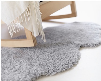
I'm not sure if I'd put a hue this bright in a bedroom  - at least not for a main wall color. However, look how nice it is just on the bedding and even in the rug. I suppose if you're a teen girl this would be perfect but for the most part, a more subdued color would be best.

So to recap, if you like a really bold color and you're not sure where to put it, take it in baby steps, one step at a time and in small doses until you feel comfortable with it.


Wednesday, October 5, 2011

Chocolate Lovers' Series: Peppermint Patty


Black and white. Opposites. Dramatic. Classic. Sharp. Striking. Beautiful and any other word you can describe these two colors that can be seen in the Peppermint Patty.

Actually, it's not exactly black but a very dark brown, almost black which is just as striking. So today, I'm talking high contrast color.

credit
How perfect is this bedding to capture the Peppermint Patty look?

This color scheme is beautiful for bedding but would you put such a dark hue on your wall? Black/brown is trending well as main wall color somewhere I'm sure - I personally prefer to use it in accessories instead of wall color or

… with furniture …

Pinterest
… with fabric …

… with texture …

… and art …
Fine Art America
and of course, great color …

Like these Sherwin Williams colors? Try
Andrion and Incredible White